The Most Important KPIs to Be Tracked by Using Marketing Data Visualization Dashboards, 2019
Digital Marketing | USA
Getting enough data obviously isn’t the problem, neither is analysis. The issue comes with visualizing the data in order to make sense of it all instantly. That’s what a marketing data dashboard is designed to do. Data visualization is the presentation of data in a visual format. It allows users to easily identify behavioral patterns, trends, and correlations through illustrative techniques and software. With the growth of big data and the desire to mine information from all customer interactions, data visualization can be a powerful tool to quickly observe trends and take action on the data observed. Data visualization makes it easier for executives and leaders across all disciplines to access key data and apply the insights to drive customer and business strategy.
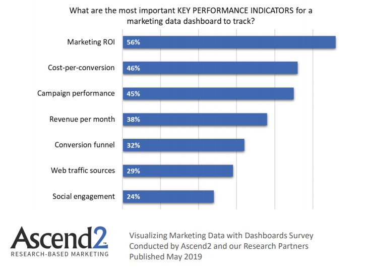
Take a look at the most important KPIs for a marketing data dashboard to track, 2019:
- Marketing ROI is ranked as the most important key performance indicator to be tracked by a marketing data dashboard with a rate of 56%.
- Cost-per-conversion is ranked as the second most important KPI by surveyed marketers to be tracked via a marketing data dashboard with a rate of 46%.
- Campaign performance comes next as an important key performance indicator for a marketing data dashboard to be tracked by surveyed marketers with a rate of 45%.
- Revenue per month also listed as an important KPI to be tracked via a marketing data dashboard with a rate of 38%.

A Graph Shows The Most Important KPIs For a Marketing Data Dashboard to Track, 2019.


