4 Tips for Creating a Memorable Visual Presentation
Digital Marketing | Jun 22, 2023
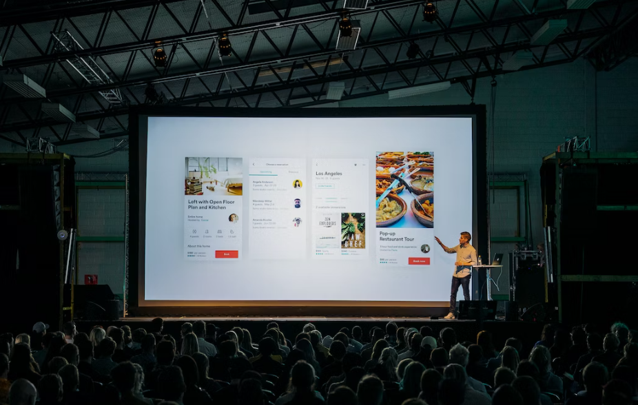
Sensory marketing explores the five senses to connect the audience to the brand with the objective of conversion. Therefore, a visual presentation needs to be very well thought out by the responsible designer during its development and construction.
In this area, presentations are constant. However, they are not always designed to be attractive and efficient. An error that can delay project/budget approval and even jeopardize closing with a client.
The purpose of this post is to talk about the importance of visual presentations for the marketing sector and bring the top 4 tips on how to create an impactful visual presentation to surprise the public!
Why Is Visual Presentation So Important in Marketing?
There are several ways to dialogue with the consumer and marketing has the challenge of attracting and stimulating lead action. In order to convey a positive and effective message in this communication, it is necessary to be strategic and use conversion mechanisms.
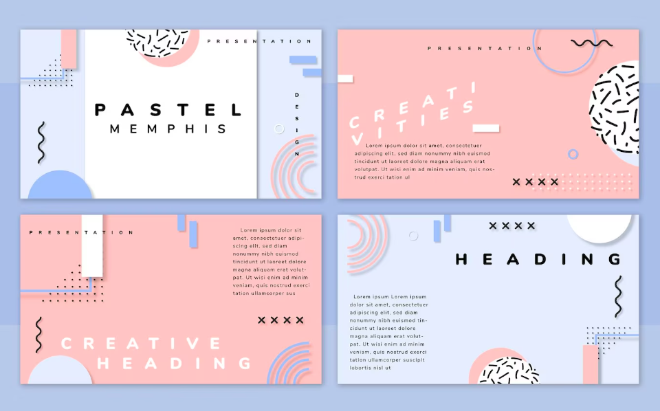
In visual presentation using background Powerpoint templates is essential, especially in digital marketing, judging by the behavior of people, who pay more attention to graphic elements. In the online environment, dynamism and interactivity prevail, demanding creativity from marketing professionals and agencies.

How to Impact the Audience With Good Presentations?
In a layout of colors, images, and texts, the visual presentation must facilitate the understanding of the audience. There are 4 tips that can help you develop amazing presentations with high conversion power!
Let’s go through the top 4 tips for creating a memorable visual presentation in 2023:
- Build slides based on the consumer journey
Knowing the audience profile, their needs, and their pains is essential to plan marketing strategies. In this context, it is necessary to understand what stage they are in to build a presentation based on their buying journey.
The slides have a sequence that needs to be respected so that the audience can follow the speaker’s reasoning. A speech different from what is seen on the screen, in addition to compromising credibility, can confuse the audience’s understanding.
- Use legible and compatible fonts
When creating a visual presentation, be empathetic and put yourself in the audience’s shoes, imagining how they would like to consume the content. The fonts must be easy to read, and contextualize in a visual identity compatible with the reality of the addressed public.
The font size, design, and color influence the audience’s desire to stay tuned in the presentation. Small letters, shaded and full of effects, can get tired very quickly and ruin the chances of conversion.
- Use colors according to the customer’s visual identity
In the same way, the colors must be designed to facilitate assimilation without exaggeration and extravagance. The use of videos and examples of graphic pieces of the project can help to give more depth to the idea.
The Psychology of Colors can help in this sense as it brings a study with the meaning and stimulus of colors. In this way, this harmonic combination of tones can create an immediate attunement and familiarity with the audience.
- Use numbers and data creatively
Data is important but if used incorrectly it can become dull and have a reverse effect. Numbers and statistics help confirm a performance or result and can be used in a visual presentation as long as you are creative.
For example, if the objective is to talk about sales success, use percentages instead of values. If the idea is to show the evolution of preference for a product, an objective graph can better present this result.

Conclusion:
With a good background presentation, you can create impactful visual presentations for the marketing industry. Marketing’s job is to sell and for that, it needs to make potential customers prefer the brand to any other on the market.
The visual presentation must provoke enough emotion for the lead to make one more decision and move forward, going against the brand’s products.
Warning: Undefined array key "sidebar_ads" in /home/dmc/public_html/wp-content/themes/DMC/functions/helpers.php on line 824


